 |
| Lem the Bard |
Wednesday, July 25, 2012
Lem the Bard
Here is my latest painting in ink wash - Lem the Bard, an iconic character from Paizo's Pathfinder series. Below the final you can see the process. By the way, Lem is a halfling (like the hobbits from Lord of the Rings).


Friday, July 20, 2012
Marvel's the Dazzler
Here's my latest Marvel hero... the Dazzler! I couldn't decide which to post so I've posted both versions I did of her, one using a brush and the other a quill. Let me know if you prefer one over the other.
 | |
| The Dazzler painted with a brush |
 |
| The Dazzler drawn with a quill |
Tuesday, July 17, 2012
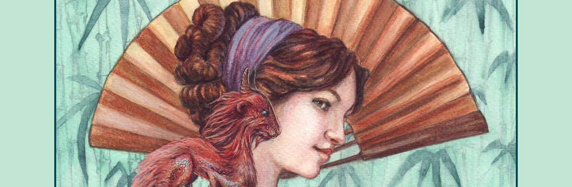
Pathfinder Iconics - Lini
After getting a positive review from a Paizo Art Director at GenCon last year, I have finally got around to starting the Iconics she suggested, starting with Lini.
The final is in pencil and ink on watercolour paper (which has a slight
texture to it). I will do the next Iconic on a smoother paper to see
the difference it might make. The Iconics will be in grey-scale first,
then be coloured in Photoshop.
I am also working on a Marvel character sheet having already done Luke Cage (70's version) and The Wasp
(60's version). The character sheet theme will be a progressive
chronology of their first appearance in Marvel comics. Look out for The Dazzler, she'll be posted next.
 |
| Lini and Droogami |
 |
| thumbnail |
 |
| basic sketch |
 |
| tight sketch |
 |
| final sketch with some inks |
Wednesday, July 11, 2012
Wonder Woman in Ink Wash
 |
| Pencil Sketch on Watercolour Paper |
 |
| Indian Ink Wash |
This is where the sketch is as of today, I may go in at a later date and colour it digitally. I used watercolour brushes for most of the painting and used a Chinese calligraphy brush for the hair. I also used Winsor & Newton non-waterproof liquid indian ink on Bockingford 300gsm Medium Surface.
Tuesday, July 10, 2012
Revising some old art
Last year I had a go at paying tribute to Frank Frazetta with my own version of a warrior princess painted in watercolour and gouache. Recently I have been going through my art in order to put together different portfolios suiting the various requirements of the companies I am approaching for work. One of these companies requested black and white and grey-scale images. When I came across my old warrior princess painting I discovered the tonal range was terrible and a lot of contrast was lost once changed to grey-scale, so I decided to go about adjusting the contrast using dodge and burn tools, a level adjustment layer and a gaussian blur layer. I also fixed the horn on the right side which had been bothering me since I painted it (I have no idea how I managed to get that so off balance in the first place). The resulting process can be seen below. I find myself slightly happier with the grey-scale image then the colour one.... however there is something not quite right that I just can't put my finger on....
 |
| Original with automatic grey-scale |
 |
| Grey-scale adjusted manually with levels and de-saturation layer |
 |
| The final image with some added dodge and burn |
Subscribe to:
Posts (Atom)